The Efficacy Of Design Guidelines In Data Visaulization
To use or not to use?
Introduction
At the beginning of my Advanced Data Visualization class, a classmate excitedly told me, “I’m starting to see the importance of design!” As a student split between computer science and design, I was torn — I felt so happy that the significance of a good design was being appreciated more in the field, but I lamented the number of engineers I’ve come across who simply don’t value customized, well-researched design.
With the rise of tech, data visualization is becoming increasingly prominent as a means to disseminate information. Visualizations are often seen on news stations, social media posts, and online articles. Data visualizations are becoming increasingly pervasive for good reason: Firstly, often times, good visualizations will avoid technical jargon and complex textual analysis found in academic research, making them accessible to larger audiences. Secondly, visualizations are also often more engaging, with useful interactions to enhance comprehension and higher visual interest in comparison to a normal chart, table, or paper. “But, Christie,” you may say, “I don’t care about data visualization! Why is this article relevant to my life at all?”
Our current news cycle contains a staggering amount of misinformation, with publishers increasingly willing to dramatize news to capture readers’ attentions
“How can thoughtful analysis of minimum wage rates and unemployment trends possibly compete with yet another celebrity breakup, the one hygiene trick your dentist does not want you to know, or nine cats who look like characters from The Office?”
Furthermore, we often take visualizations as true at face value —
they imply that someone has performed accurate and methodical
analysis on objectively true data

Graphical elements in a visualization are alarmingly easy to manipu- late; they can show objectively true data through an extremely
subjective lens. Changing axes scales, limiting axes ranges, and misleading sizes of visual elements are just a few ways designers can misrepresent data, whether intentionally or not. Consider Figure 1, a well-known misleading graph that pushes the narrative that gun deaths had decreased after enacting a “Stand Your Ground” law in Florida when, in actuality, there was an increase in gun deaths. As a community, visualization creators must consider the impact that misinformation can have on the audiences for their visualizations, a topic that this article will dive into.
Visualization designers often rely on a set of design guidelines, some backed by research and some seemingly backed by common sense, to create “good” visualizations. Are these design guidelines truly helpful? Should design guidelines even exist? How effective are they? This article examines the harm of pushing design guidelines as a strictly helpful structure for data visualization.
“Data appear[s] objective, precise, and replicable but offer a near-endless array of presentations, framings, and comparisons that can be used to tell a wide range of stories.”
So. What makes a good visualization?
“Good” is a rather obviously subjective term. For example, a close friend of mine enjoys eating durian. If you were not aware previously, durian is often identified as the worst smelling fruit — so much so, that some establishments in Asia, where durian is most commonly found and consumed, have banned guests from bringing it on the premises. My friend thinks durian is a good fruit, but other people clearly strongly disagree. While visualizations most likely won’t be getting banned from Asian businesses any time soon, an audience member’s perception of it can vary in a similar fashion. So, what makes a good visualization? Who decides?
Design guidelines are often used as a measure to how effective
a visualization is for its audience. We can look towards existing
academia to see what guidelines have been generally deemed
successful by the data visualization community. According to
Psychological Science in the Public Interest, also known as PSPI,
good visualizations can be defined by how their elements work to
minimize uncertainty
- Accessibility: for example, color-blind-safe design or compatibility with screen readers.
- Visual grouping cues to guide viewers in making meaningful comparisons.
- Annotations and color highlighting to guide viewers to pay attention to specific relationships between elements in the visualizations.
- Useful interactivity: interactivity does not necessarily improve performance, but it can make the visualization more engaging and memorable for viewers. In addition, allowing users to explore visualizations can increase their understanding of the data.
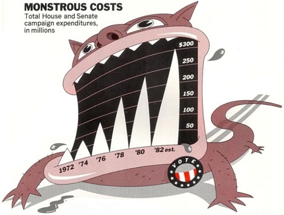
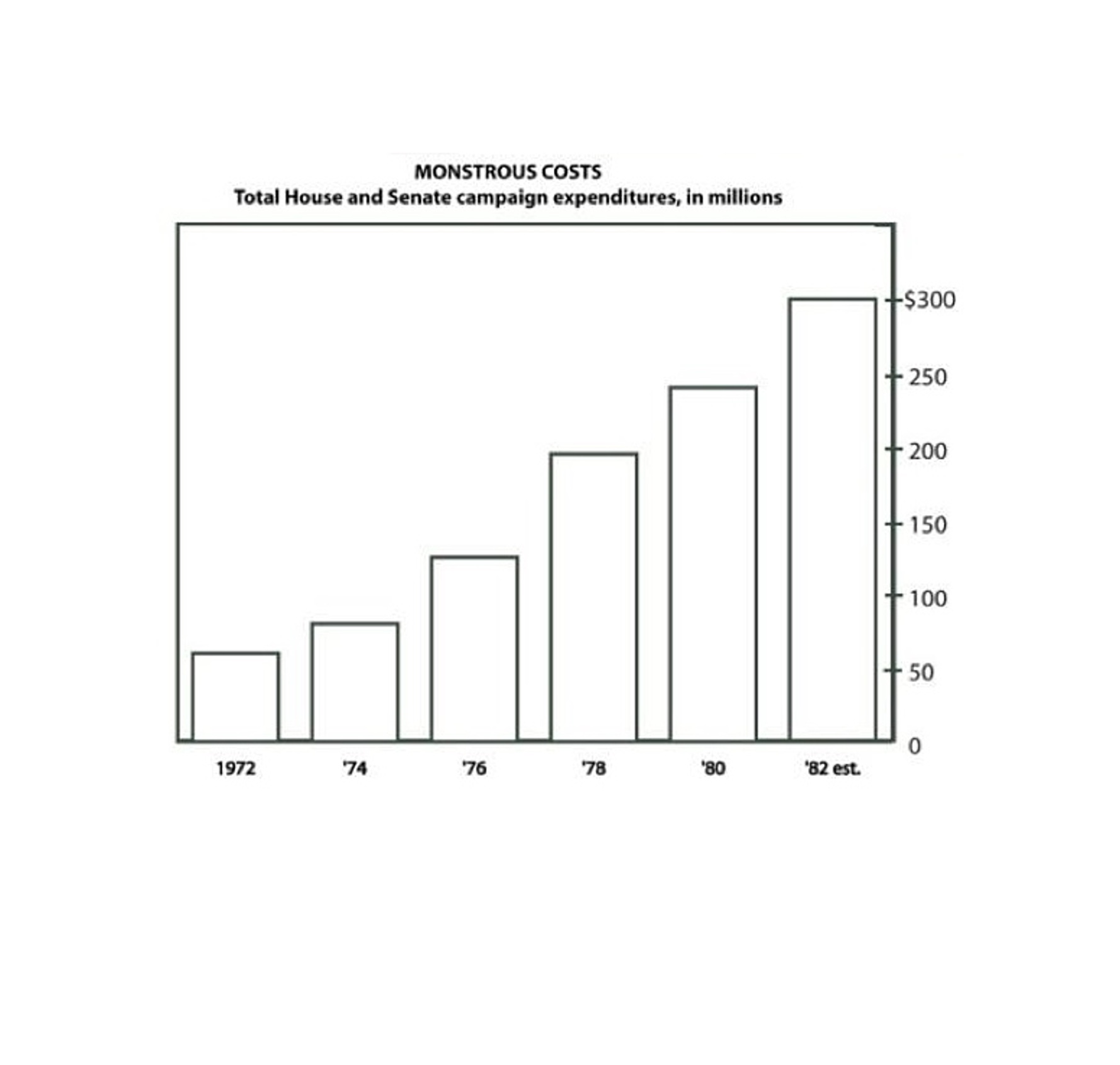
Edward Tufte, a professor at Yale, is widely considered one of the
pioneers of data visualization. He introduced the word “chartjunk”
to the visualization field in his first book, The Visual Display of
Quantitative Information, and it has sparked debate ever since


Are all design guidelines bad?
No!
Before I start to look at the negatives of design guidelines, I do want to concede to some benefits.
Engineers who do not have a design background often struggle making visually compelling, aesthetically pleasing, and effective visualizations. Data visualization already has a higher barrier of entry, as analyzing huge sets of data often requires some knowledge of computer science and statistics at minimum. Having basic design rules to follow when creating visualizations simplifies some of the obstacles in data visualization and somewhat reduces the need for a designer, which otherwise would require additional cost, time, and communication. In addition, design guidelines are generally made with good intentions, encouraging visualization creators to accommodate larger audiences by making the images more visually and conceptually accessible to as many people as possible.
However, despite the good intentions behind design guidelines, it’s important to examine how actually effective they are in improving visualizations, especially as more and more people get their information from data visualizations — for example, I’ve opened the COVID-19 dashboard on Google at least three times a week for the last two years.
Iterative Design
From an engineer’s point of view, I can understand why these guidelines sound great. However, from a designer’s standpoint, I see that these guidelines could introduce many limitations on the design process. So, what are some potential flaws of design guidelines?
Now, I won’t pretend like designers don’t have our own kinds of design guidelines. My design professors teach and encourage us to follow many of these types of guidelines. For example, large blocks of typography should err on the side of consistency, colors shouldn’t hurt your audience’s eyes, and clickable elements on a page should have some indication of clicking (eg. hover states). However, these guidelines are often immediately followed up with encouragements to experiment outside of the given advice. We very often will study work with dynamic typography, neon color accents, and interesting, non-linear layouts. Stand-out interactions on a website can be incredible. These supposed “breaks” in system can be extremely successful — although admittedly, they also do fail.
A large part of why these designs still work despite being contradictory
to what some may call “design guidelines” is largely due to
iterative design, a popular process in both analog and digital design.
Iterative design is a popular topic online, with an abundant number
of articles not only discussing its importance but also outlining
specific steps in iterative design; most of them vary slightly but have
a similar message. Since this article focuses on data visualization,
here’s a take on iterative design from Editor X
- Define a timeline for your design sprint. You want to let the team experiment, but you should set a time to stop iterating. This helps your team avoid getting stuck in the design stage of a product and continue developing.
- Identify a problem through research.7 I want to highlight this last part: “through research.” Sometimes, the majority of your audience doesn’t struggle with the same parts of a product that you as a creator may struggle with. As a result, your audience may have different, unexpected needs, which you can only discover through research.
- Ideate simple solutions — don’t get attached. This step involves making multiple low stakes designs that are centered around your identified problem. These designs are meant to be thrown away and changed.
- Out of your existing solutions, prototype the best solutions and test them.
- Analyze through user research. You can conduct user research in many ways, but the end goal is the same: make sure your product is being received in the intended fashion. Don’t take for granted that the audience understands what you’re doing.
- Iterate your design forward if it’s working or consider going back to the drawing board.
Iterative design generally creates products that are more usable and effective in their goal. By generating multiple designs with low stakes, designers are able to consider more solutions — even those that they may have disregarded based on principle alone — and discover the advantages and disadvantages of each proposed design. Additionally, by working through “throwaway” designs, companies can reduce cost from retroactively solving the problem, lessening spending down the line.
With design guidelines, however, the iterative design process loses some of its edge. Why research what works for the audience if we already have rules? Why iterate our visualization design if it already fits in the guidelines? Guidelines may encourage engineers to be more inclusive, but they also imply that creators don’t need to be more inclusive or improve their visualizations after implementing them. By relying too heavily on design guidelines, engineers no longer need designers to engage with their visualizations — everything has seemingly already been handled.
Furthermore, having design guidelines assumes that all viewers of a data visualization have the same kinds of problems: trouble understanding legends, problems with color vision, etc… The purpose of data visualization is to communicate a message through data to an audience; thus, the audience’s understanding of that data should be prioritized. Using the same set of guidelines for every audience is the “simplest” way to accomplish this. However, it isn’t the only option. Engineers could create different visualizations for different audiences, for example, to make information maximally inclusive and accessible. I am by no means declaring that this is the best course of action. From a first glance, it’s already clear that this method would require additional cost, time, and labor. However, a possible insight that comes from this otherwise throwaway idea is to make customizable —not just interactive — visualizations.
In addition to limiting the research and ideating phase of iterative design, design guidelines can also hinder the visual and aesthetic aspects of visualizations, which play an incredibly important part in keeping an audience’s attention. Georgina Guthrie, a writer specializing in UX copywriting, posits that
"we don’t know what we want until we see something we don’t want. It’s just a fact of life.”
Using design guidelines prevents us from seeing the things that we “don’t want” that points us in the direction of things that we do want. As I said in previously, designers often study and praise designs that break boundaries in a visually successful manner. We simply don’t know what works until we try it.
More Research Needed
In addition, design guidelines have not necessarily kept up with forward progress in data visualization. Data visualization as a field is becoming increasingly advanced, with new ways to visualize and interact with data becoming more common practice. For example, with the digital rise of data visualization, color could now show up quite differently based on what screen mode users prefer or what themes they use for their devices. However, design guidelines centered around color haven’t made the developmental strides to account for or match these technological advancements.
With more intricate, micro-interactions growing in importance for web design, users have more control over their page than ever before, and websites are extremely attuned to keeping their users’ attentions. Do Tufte’s arguments from 1983 against non-data elements—any part of a visualization that is not strictly related to data — still hold? Are non-data elements distracting, or are they an important aspect of visual interest in an ever-faster moving digital landscape?
Furthermore, empirical research shows that some design guidelines may be counterproductive for increasing data recall.
Borkin et al. conducted a study on what actually makes a visualization
memorable. They built off the theory that data recall is faster
and easier when the visualization is more accessible in memory:
“Visual details of an image come for free when retrieving memorable
items”
They found that more memorable designs included more color,
higher visual density, high data-ink ratios (high in chartjunk), and
unique graph types
Lin et al.
The conflicting opinions in the data visualization field further encourages me to think that design guidelines should not be pushed as a strictly positive feature to visualization creations. After all, how can a set of design guidelines create the best visualization if every audience is different? And how can design guidelines be both effective and ineffective?
Bias and Motive
“Christie,” you say, “I get it — you don’t like using data visualization design guidelines. But what’s the harm of other people using them? Why don’t you just ignore the guidelines on your own?”
The question of bias and motive has risen in relevancy in the tech sphere — this question appears in numerous debates, discussions, and research on bias in artificial intelligence, machine learning, social media algorithms, … the list goes on, and visualization is not exempt from this list. The classic design guidelines discussed in this article ultimately originated from a person or group of people, but those originators usually aren’t talked about in too much detail when the guideline is being presented on its own. From my own academic data visualization experiences, I couldn’t tell you where the given design guidelines came from nor if anyone ever even told me where they came from. Who determines these design guidelines, and what were (or are) their biases?
I’ve already discussed an accredited design guideline in this article — the anti-chartjunk position of Edward Tufte. Tufte was a notorious minimalist, which clearly would align with his data-ink ratio minimization theory. He went extremely far with this approach to data visualization, even removing the left side of the bars in a bar graph. While this is consistent with his philosophy, how effective is it? How much of this practice comes from the fact that he’s generally a strict minimalist instead of the perceived efficacy of this technique?
For visualization creators, blindly trusting someone else’s theories — especially when the theories seem to lack supporting empirical data, as I discussed earlier — could perpetuate the unexpected or unknown opinions and viewpoints of their creators and could unintentionally prioritize specific functions of visualizations. Tufte prioritized a very specific visual aesthetic, but is that aesthetic most important for your audience? What if your visualization was supposed to increase data recall, instead? A pre-existing design guideline could very well satisfy your visualization’s intentions; however, many engineers rely too heavily and too quickly on guidelines without understanding their purpose and origin.
Where do we go from here?
Design guidelines can be helpful, but only when fully understood; guidelines should be examined in each visualization’s individual context to determine its efficacy and appropriateness. As I mentioned in the introduction, visualization designers have a lot of responsibility to be clear and accurate, as visualizations are widely disseminated across social media and the news as a fast and accessible way to analyze data. Visualization creators, engineers, and designers must consider what their usage of previously established design guidelines could perpetuate and how well those guidelines suit their audiences.
The current system of design guidelines has its flaws, but that doesn’t mean we have to completely disregard it. The solution to this debate in data visualization may never be truly finalized, but perhaps a good start would be to consider expanding on the specificity of our existing guidelines, teaching those who make visualizations about both if and how they should utilize design guidelines.
About the Author
Christie is a fourth-year student at Washington University in St. Louis pursuing a dual-degree in Computer Science and Communication Design. She will be working as a Front-end Engineer after graduation, but you can check out her design portfolio at https://christiece49b.myportfolio.com/work.