Enhancing Intelligence Analysis: The Importance of Tailored Analytic End-Products
Text, Visualizaiton, or Both?
In the world of intelligence analysis, delivering accurate and timely information to decision-makers is paramount. The ultimate goal is to provide “the right information, to the right person, at the right time, communicated in the right way.” This involves creating high-quality analytic products that effectively convey findings and recommendations. In this blog post, we delve into the significance of tailored analytic end-products and how they can optimize decision-making processes. We will explore the current practices of information dissemination and the need for adaptable reporting tools based on insights from interviews conducted with decision-makers in the intelligence community.
The Power of Analytic Products
Analytic products serve as valuable outputs of intelligence analysis, taking the form of intermediary data or end-products such as reports, dashboards, briefings, and placemats. Their purpose is to provide decision-makers with concise, well-supported discussions of findings and recommendations. These products are not only instrumental in shaping decisions made “at the top” but also influence the quality of decisions made at preceding levels. Research has shown that decision quality can suffer when information is presented in a format poorly suited to the individual decision-maker, even if all the relevant information is available.
We interviewed 22 professionals working in the intelligence space to gain insights about how they interact with intelligence reports, their most used and preferred report formats, and the types of decisions they make using the information from these reports. The interview contained 18 questions (see appendix material for questions).
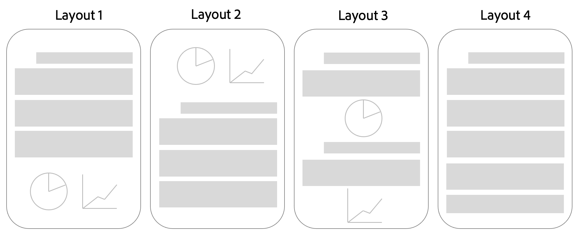
We presented analysts with four different potential report layouts. In layout 1, the graphs are presented at the end of the documents. In layout 2, the charts are presented first, followed by text. In layout 3, the charts are presented throughout the report next to the relevant text. Layout 3 is a report format without charts.

What Makes a Report Useful?
The most common responses for what makes a report useful were Clear and Accurate (n=7), Concise(n=8), and Relevant (n=5). For example, one analyst said:
"Analysts reported the following useful features: tear lineThe "tear line" is a physical line on a document, often used to separate classified and unclassified information. , charts and graphics, well-sourced end-notes, easy to transfer and download, summary section, and takeaway section."
Layout Preferences
To better understand the layout and report format preferences, we examined analysts’ reading patterns. 7 participants stated that they “Quickly scan and jump to the most important content”, 5 stated that they “Read the entire report from start to finish” and the rest reported using a combination of techniques, sometimes including both of these extremes. Among the 9 participants that used several techniques, 6 reported that they read all titles and headers first and two reported that they read the summary first.
The Prevalence of Charts in Intelligence Reports
We were interested in how often intelligence reports contain charts and graphics. Only one analyst reported that their reports never contain graphics. 8 participants reported that their reports sometimes contain graphics, 6 said that they contain graphics about half of the time, 6 said that they contain reports most of the time and 1 said that they always contain graphics.
Do Analysts Receive Reports in Their Preferred Layouts?
We asked analysts to rank their preferred layouts and justify their rankings. Out of the responses from 19 analysts, Layout 3 was ranked first the most (n=8), and Layout 4 was ranked last the most (n=14). We examined the rationale for these rankings and found that the analysts who ranked Layout 3 as the most preferred liked to see charts inserted next to their corresponding text to improve flow and comprehension.
"I prefer the graphics to be spread out throughout the text, like in Layout 3, and that they relate to the information within the paragraphs around the graphic."
Analysts who ranked Layout 4 as their least preferred layout believe that reports with charts are faster to read, improve information retention and comprehension and consolidate information in the text. It is important to note that all three analysts who ranked Layout 4 as the most preferred layout deem charts unnecessary for their tasks.
"Layout 4 is just a wall of words and can be difficult to read without a graphic. I know some reports don't need or come with graphics, but they can be difficult to read if it's a dull topic or too detailed."
Conclusion
Based on our findings, we believe that a personalized interface that accounts for users’ reading patterns and preferences, as well as report type and decision type, would benefit intelligence analysts. Further research must be conducted to define the interface’s compatibility with the existing workflow. Other more straightforward solutions to improve productivity would be to improve cross-referencing by seamlessly linking similar reports. Moreover, further investigations into the factors that impact report credibility and trust would be beneficial to support implementing systems that detect untrustworthy signals to improve decision quality.
Acknowledgments
The authors thank our NCSU collaborators for their expertise and guidance and the 22 decision-makers who participated in this study for their time. This material is based upon work supported in whole or in part with funding from the Laboratory for Analytic Sciences (LAS). Any opinions, findings, conclusions, or recommendations expressed in this material are those of the author(s) and do not necessarily reflect the views of the LAS and/or any agency or entity of the United States Government.